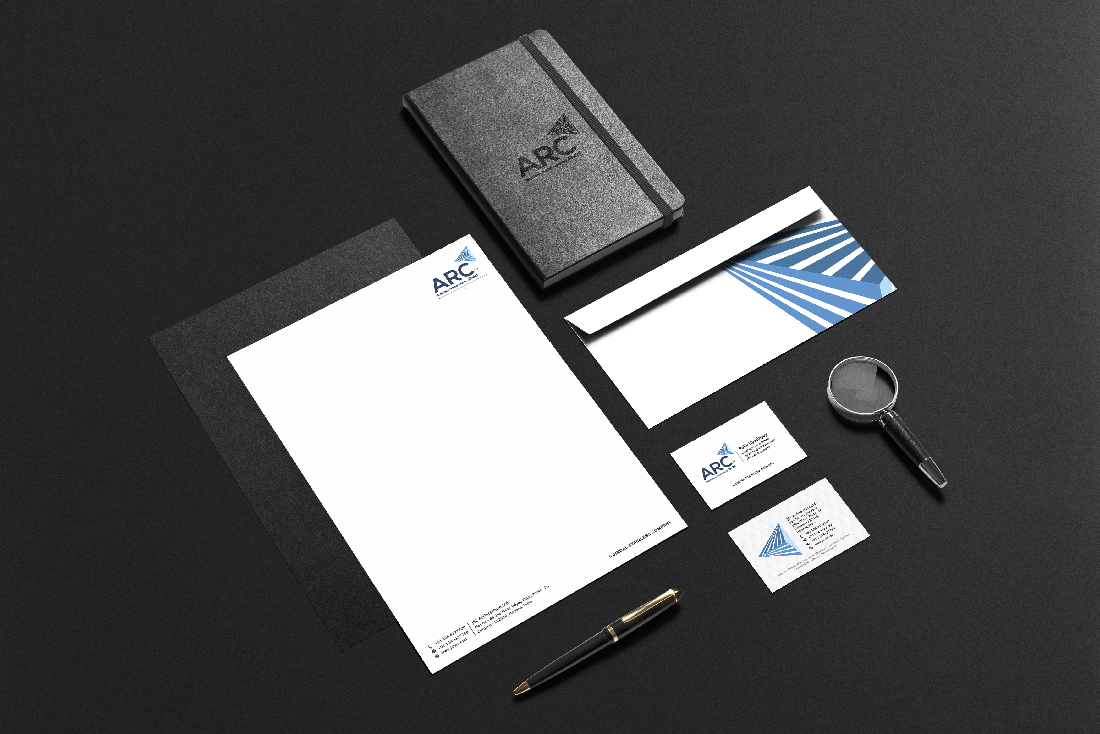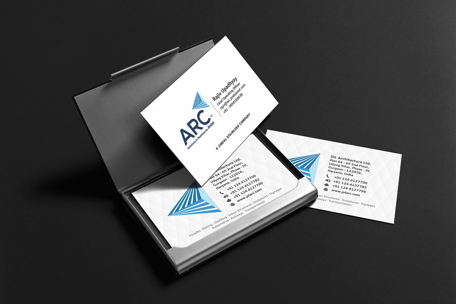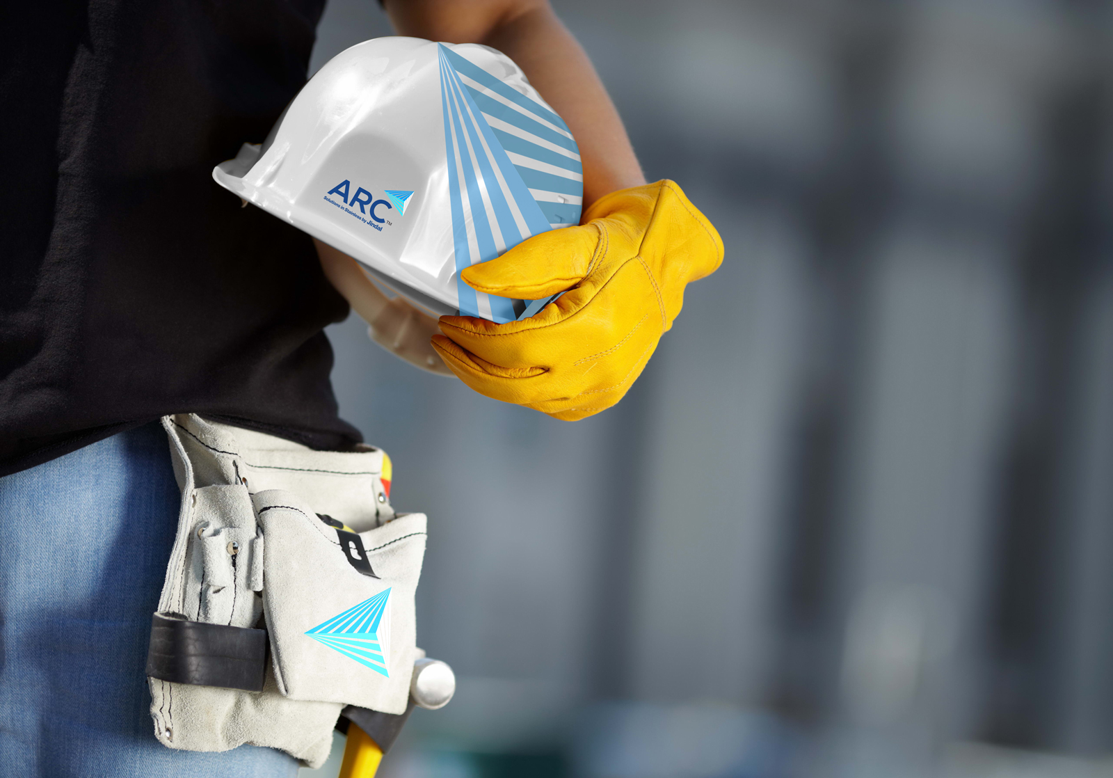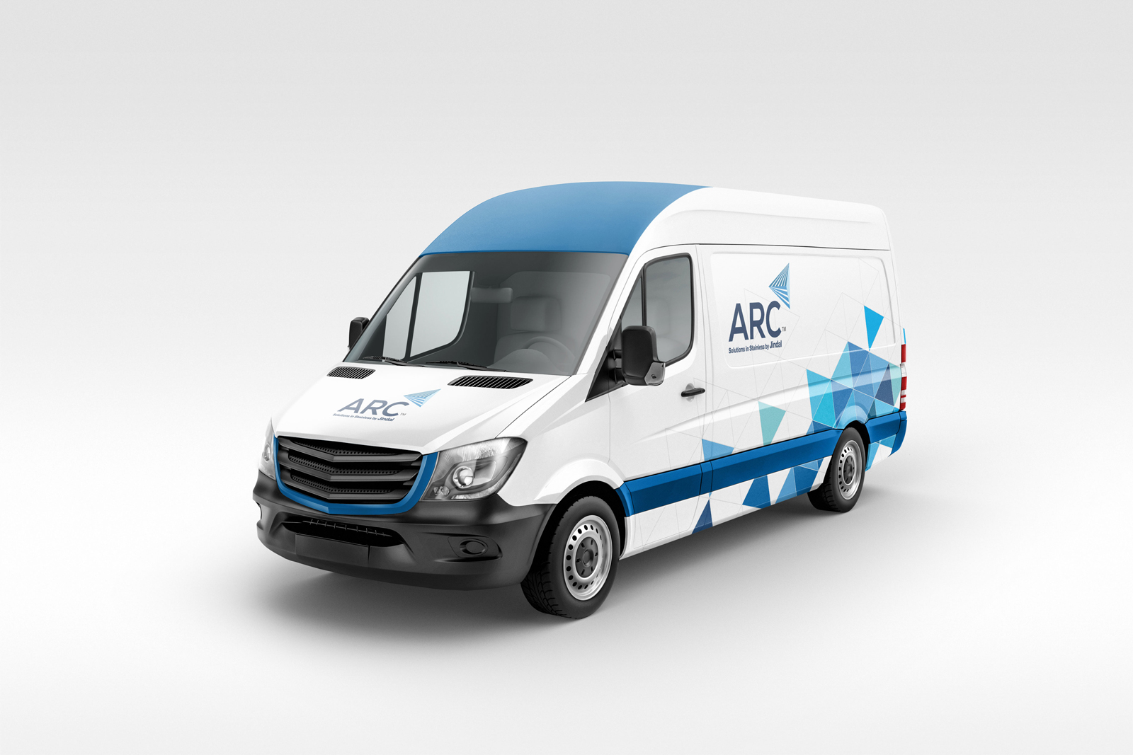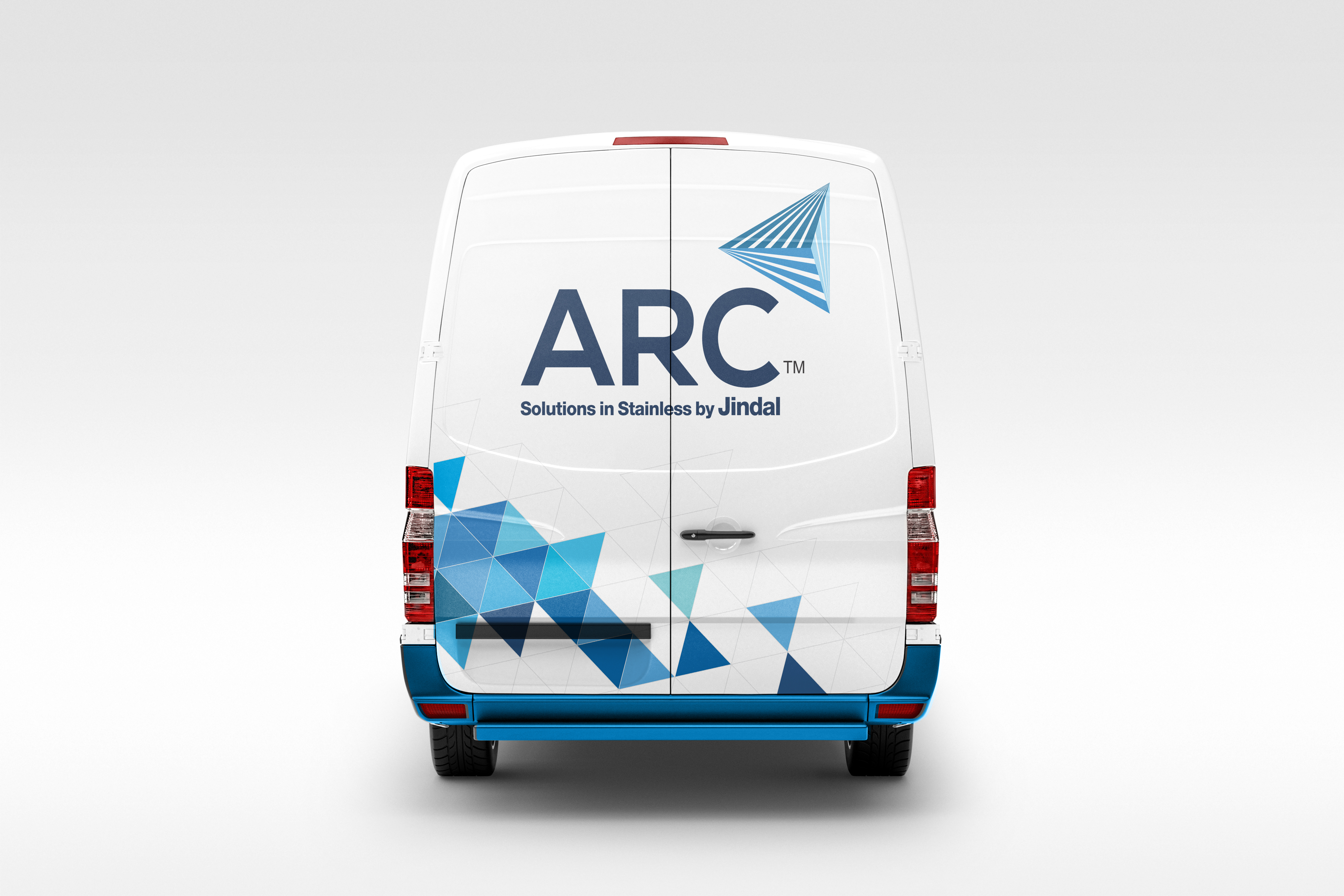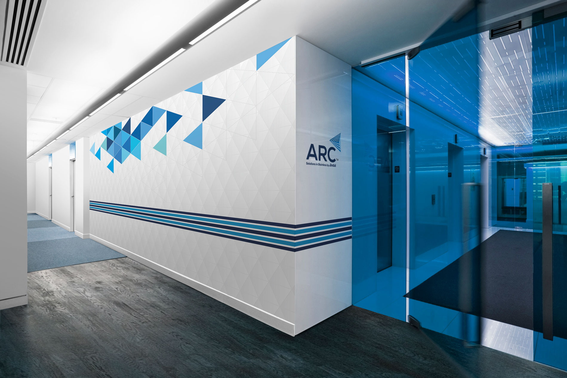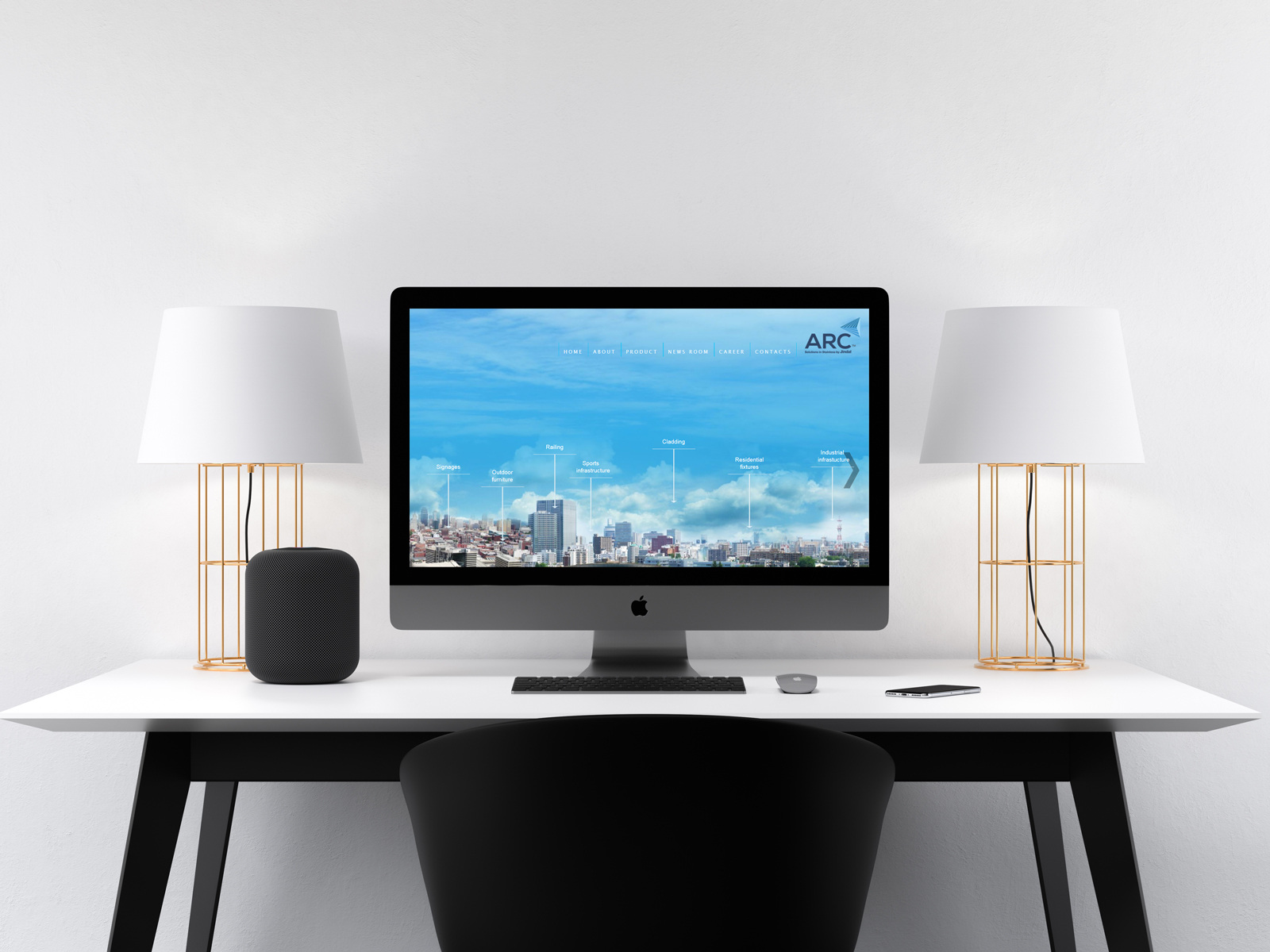
ARC had a great future in the untapped and unorganized Indian market. As a Brand Revamp Agency, the goal for us to shape its personality and claim leadership in this domain for the brand.
We seized the opportunity and made optimum use of it. The new revamped brand logo resonated with its innovative solutions, aesthetics, utility, durability, trust and its game-changing potential.
The fonts chosen for ARC reflected its high position in the market place. We chose an upper case font to suggest pride and confidence and dipped it in hues of blue to give a feel of allegiance and class. To portray the brands unique personality, we needed something equally spectacular in terms of image. Hence, we picked an image of path of rays travelling in different directions converging to form a prism. This image resonated with the core values of ARC. It depicted vividly and with charisma, the dynamism and potential of the brand. The prism that converges and diverges into spectacular colors was positioned strategically at the right top corner of the ARC logo to show its elevation, its rise to power.
