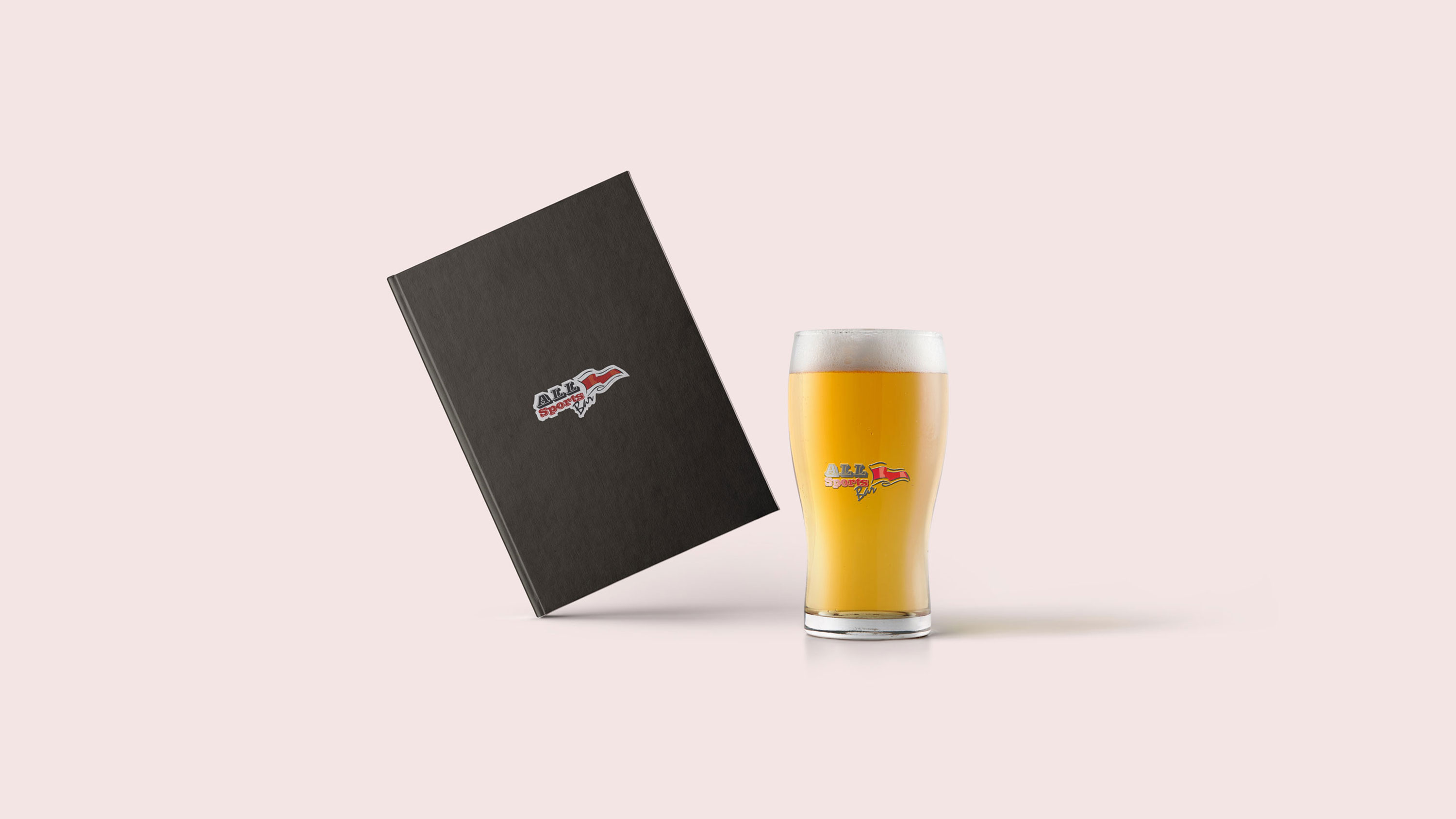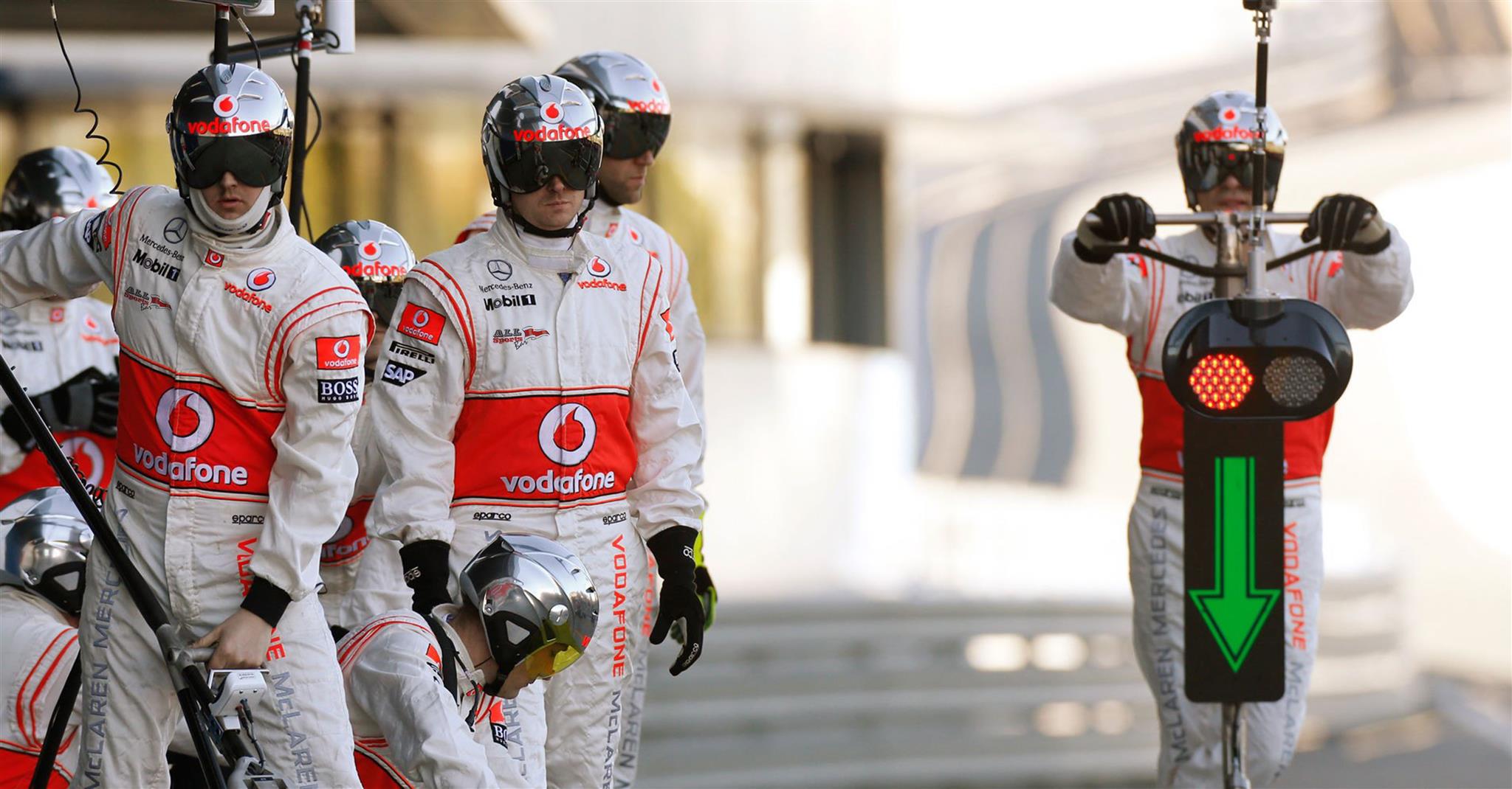

As a Branding Agency in India, we went for a bold and sporty font over a flying curved shape that resonated with the sports angle of the bar to create a unique brand identity. To give it an iconic look, we used furling flags on both sides of the font, the flag giving off a feel of triumphant victory as well as fun and cheer. We used a combination of striking red and black colors. The brand was given a funky and young tagline, “Eat. Drink. Watch Sports’, which showed off the merging of bar and sports concept.. To go with the image of the brand, we extended the theme to servers’ uniform, tablemats, coasters, bill book, tent card and a specially designed tabloid menu that changed every month. A unique website full of news and views on sports from journalists and experts was created. It was a novel concept and with the creativity we put in to present the brand with its core values, it certainly stood out. The newspaper and radio adverts were the cherry on top.
